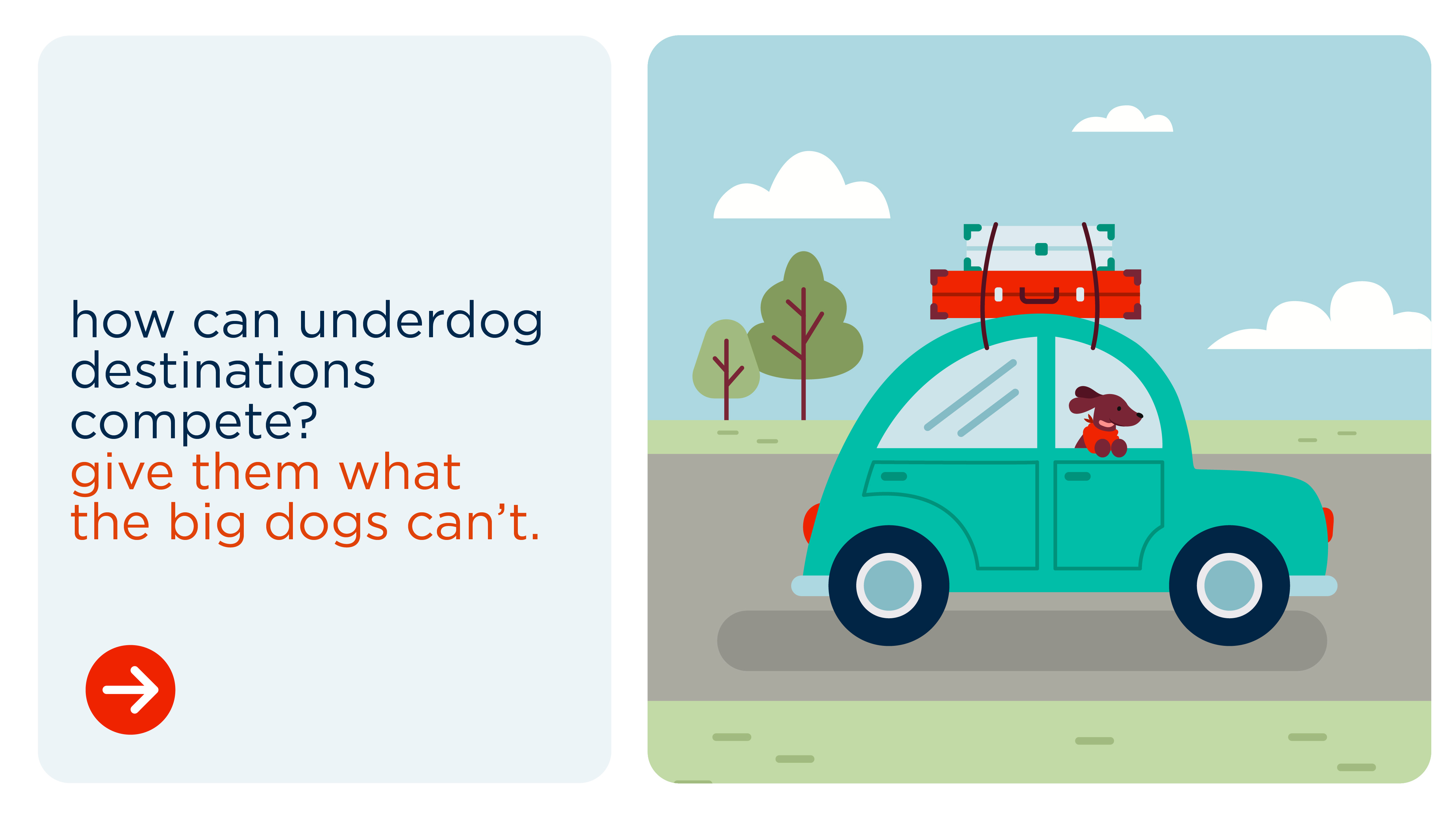
Article Image - A Very Scary Ux Halloween Story: Dark Patterns And Bad UX

A Very Scary Ux Halloween Story: Dark Patterns And Bad UX

By: Kat Richards
October 2020
5 min

It’s that time of year. The time when everyone gets to dress up in costumes, decorate the house and eat lots of candy. But today, we’re not talking about trending Halloween costume ideas or the most popular Halloween candy, it’s something far scarier…

This is a story about dark patterns, a form of trickery used by web designers and creators that relies on exploiting basic human instincts like shame and fear to increase the dependency on technology. It’s when user interfaces (UI) & user experience (UX) are used to mislead or trick (not treat) users; it manipulates human psychology to get users to do what designers want them to do. We’ve seen glimpses of it from the popular Netflix show, The Social Dilemma, but it’s existed for a very long time. And it’s everywhere.

So, what do these types of UX dark patterns look like and how can marketers avoid this trickery? Here are 4 common dark patterns to avoid in your UI/UX design:

This is most common in subscription-based services or “free” trials with credit card information like Blue Apron and HelloFresh. It’s easy to get in, but a whole lot harder to get out of the service. When the trial ends, these brands don’t make it easy for users to opt-out—no friendly reminder that the trial is over and no easy way to cancel without going through hoops.

This dark pattern creates distrust with users and increases their level of frustration. It is a deceptive behavior when businesses use this tactic in hopes that users will give up and continue to pay.

Another one we see often, especially on e-commerce sites, is confirmshaming. This usually happens in pop-ups and modals asking for your email address to redeem a discount. This shaming or “guilt-trip” tactic is a UX writing dark pattern that appears in CTA’s like “I’m not into savings” or “I’d rather pay full price” when users want to opt-out. See examples of confirmshaming for reference here.

Confirmshaming manipulates users into selecting the choice the business prefers by using shameful language in an attempt to guilt users. This practice can backfire, causing users to be annoyed, with feelings of manipulation and deceit.

There are other subtle dark patterns within this as well. Things like making the “dismiss” button a very small font or a different color that looks unclickable, making it more difficult to find the “close” button by placing it on the far left or outside of where users expect.

Another dark pattern used on tiered solution purchases or booking lodging options is deliberate misdirection. This focuses the users on the more expensive option deliberately, making it more difficult to find the cheaper option. This is commonly seen on websites such as airlines, where additional upgrades and add-ons are default selected, before users can proceed to complete the purchase. Another example is when “opt-out” is hidden under an unintuitive list where it requires more user attention to find.

Similar to the other dark patterns, this builds distrust with your users by showing them the more expensive option as default and requiring additional effort to find the one that suits their needs.

Say hello.